The BC Hockey League for its 60th celebration is having all 18 teams have a retro jersey or jersey that represents hockey history in a respective team’s region. Along with the jerseys, each BCHL team will hold a retro night to honor their team or regional hockey history.
The BCHL has released its schedule for these nights, starting this Saturday with the Cowichan Valley Capitals. After further inspection of the schedule, the Trail Smoke Eaters are involved in four other retro night games besides their own on Oct. 29. Penticton and Vernon are tied for the second-most with three. The Chilliwack Chiefs are in back-to-back retro nights as they host theirs against the Smokies on Dec. 3 before heading over to Victoria for the Grizzlies’ on Dec. 4.
Penticton and Vernon are the only two teams to play retro nights against each other. The Vipers host Pentiction on Nov. 27 and the Vees welcome Vernon on Dec. 17.
Brand-new looks with an old-school feel. Retro designs for our 60th season.#BCHL60 pic.twitter.com/gpu9oqhd5C
— BCHL (@BCHockeyLeague) October 14, 2021
Alberni Valley Bulldogs
Alberni Valley, like a few of its counterparts, is a young team with not much jersey history behind it. The Bulldogs went with a Detroit/Chicago-style mash-up. The jersey is striped like the Blackhawks’ current home jerseys but is laid out like the Red Wings’ vintage jersey from 1991-92. I rate this jersey a six out of 10 as it’s a nice middle-of-the-road jersey.
A closer look at our #BCHL60 sweaters🔥
Mark your calendars because we’ll be hosting three retro nights this season…
December 3rd vs @BCHLSmokeEaters
January 8th vs @WenatcheeWild1
February 5 vs @BCHLGrizzlies #ChwkChiefs pic.twitter.com/bJEid7vxMi— Chilliwack Chiefs (@Chiefs_Hockey) October 14, 2021
Chilliwack Chiefs
I’m very disappointed with the Chiefs. In my opinion, they missed the mark completely on this jersey. I’m not sure where the inspiration is but it’s like they took their 1995 blue jersey and threw stripes on it and thought it looked good.
I’ve voiced my displeasure for circles around logos unless it’s done right and this is not one of them. The Chiefs have some great iconic jerseys they could have put their current colors on or brought back to life and they missed. The Chiefs could have also gone further back and resurrected a jersey from one of the Chilliwack teams from the 70s or 80s. This jersey is a one out of 10 for sure.
Together, we celebrate.
01.22.22. pic.twitter.com/NgMAsdyY1E
— Coquitlam Express (@BCHLExpress) October 14, 2021
Coquitlam Express
Coquitlam hit the nail on the head with this one. Pulling inspiration from the 1930s Boston Bruins and the Kingston Frontenacs of the Ontario Hockey League. The striping on the arms gives it that retro look. The logo of a steam train head-on looks as if it’s coming at you. This is an example of a circle logo done well. I give this jersey an eight out of 10.
🔵🔴⚪️ #BCHL60 | #BlueCollar pic.twitter.com/CM3UwBWH5u
— Cowichan Capitals (@cowichancaps) October 14, 2021
Cowichan Valley Capitals
Cowichan went a very nice route with its retro-inspired jerseys, going back to the mid-2000s with the jersey colors and bringing back the bird logo as a shoulder patch.
The logo is kinda lackluster with an odd-shaped shield, but the addition of the five stars that could represent the decades the team has been around being a nice touch. This is a five out of 10 for me as a retro main logo could have been a better choice.
Cranbrook Bucks
From the video released by the BCHL, Cranbrook is exempt from the retro jersey this season, unless there’s something else in the works.
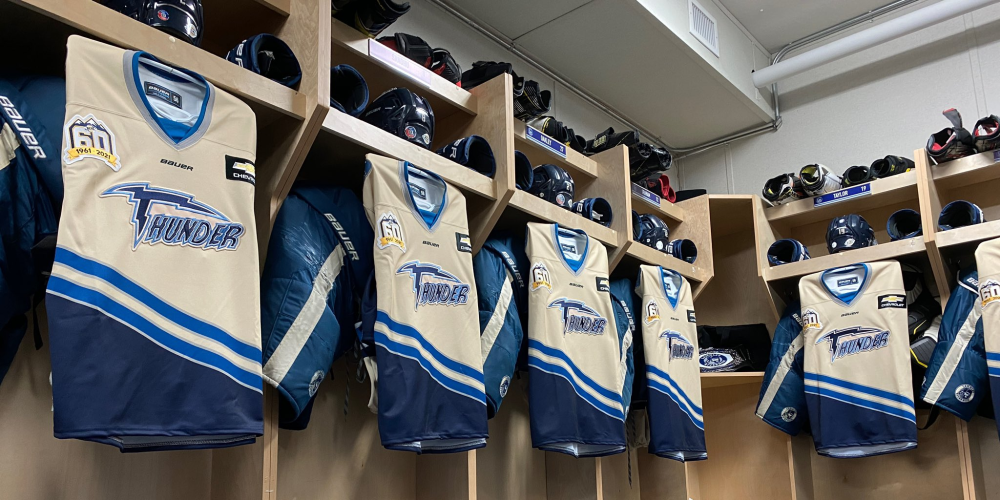
Throwback Thursday ➡️ Langley Thunder!
Our retro jerseys for the BCHL’s 60th anniversary will pay homage to the Langley Thunder! #BCHL60 | #RivNation pic.twitter.com/M37sfWWxDl
— Langley Rivermen (@LangleyRivermen) October 14, 2021
Langley Rivermen
Langley is one of the clear winners this year with its jersey. Since becoming the Rivermen in 2011-12, the jerseys have really not changed. For the retro jersey, the franchise went back and brought back the Langley Thunder jersey from 1996 and put their current colors on it to make a reverse retro and they are fire. This jersey gets a 10 out of 10 for me.
#THROWBACK
It's #BCHL's 60th year, and the Cents are set to unveil their #retro jerseys!
This look is inspired by our first year in the league (1973-74) when Fred Berry was the team and leagues leading scorer
We host our Retro night against Vernon on Nov 19th! #SaddleUp pic.twitter.com/LaFnAEhaTI— Merritt Centennials (@BCHLCentennials) October 14, 2021
Merritt Centennials
Merritt is the longest continuously run team in the BCHL and their current threads are already pretty retro. The Cents went all the way back to the mid-1970s with their jersey featuring a white version of the current logo. It also features white shoulders and white and black stripes along the arms and bottom of the jersey. A six out of 10 for this throwback to a simpler time.
We are throwing it back on November 20th with the Retro Jersey.
Single game tickets for our Retro Jersey Night and our Home Opener presented by Panago are still on sale but selling quickly – go to https://t.co/IefFtAj8x7 to secure yours today.#backonhomeice pic.twitter.com/P4U9SVKKiw
— Nanaimo Clippers (@ClippersHockey) October 14, 2021
Nanaimo Clippers
Nanaimo went waaayyyy back with this jersey. It is navy blue with cream and red stripes and a tie-up collar. The logo is a plate shape with a profile of a clipper ship with the wordmark curved over and under in red. The Clippers have some fantastic throwbacks and this just adds to that collection. This one gets a seven out of 10.
An iconic look.
On December 17th, we throw it way back to the 1960's with our retro jersey!#BCHL60 pic.twitter.com/sZyT5O5yb3
— Penticton Vees (@PentictonVees) October 14, 2021
Penticton Vees
Penticton has already worn a retro jersey this season, donning a 1986 Knights jersey that looks absolutely stunning. The second retro jersey is the original version of the 1961 Vees look that the club brought back a few years ago but in their current color scheme.
These go with navy blue and cream stripes up the arm and around the bottom and top of the jersey. The Vees will also go with cream-coloured gloves to make the look complete. I give this a seven out of 10, the Knights jerseys the Vees have already worn are much better than these.
Gotta get another look at these beauties. Still TBD when we'll dawn these at the Hap but they are going to look so good in action.
Learn more about the history of the Flyers and where the inspiration for our retros came from – https://t.co/hP8TJKa7oD pic.twitter.com/GmQHf8USI3
— Powell River Kings (@BCHLKings) October 14, 2021
Powell River Kings
Powell River not only went retro with its jersey, but they went all the way back to when the Kings were known as the Abbotsford and Delta Flyers. The Kings didn’t just bring back the Flyers jersey and put their colors into it, they recreated the logo to be as if the Flyers were from Powell River. The Kings have definitely thought outside the box and this is a 10 out of 10 for me.
November 5th.
Spruce Kings vs. Smoke Eaters at the Mix.
Our @BCHockeyLeague Retro Jersey has arrived!#BCHL60 • #Spruce50 • #TrueBlue pic.twitter.com/HZVSA85ugB
— Prince George Spruce Kings (@SpruceKings) October 14, 2021
Prince George Spruce Kings
The Spruce Kings are going all out this year as it’s also their 50th anniversary. The team is also bringing back jerseys from the 80s, 90s, 2000s, and 2010s. The jersey for the retro reveal is their 1972 jersey when they were part of the Pacific Northwest Hockey League. These are solid retro jerseys with a timber industry-style logo. Simple blue shoulders and cuffs make this a very nice eight out of 10.
Back To Our Roots. #BCHL60 pic.twitter.com/zjPOUiqNht
— Salmon Arm Silverbacks (@SASilverbacks) October 14, 2021
Salmon Arm Silverbacks
Salmon Arm just knows how to do things. The Silverbacks brought back their inaugural jersey from 2001-02. Earlier this season, they brought back the purple in their home and away jerseys and now they resurrected the jersey that started it all. This is a 10 out of 10. It brings back memories of the Backs being one of only two teams to win in the old Chilliwack Coliseum, which was a very rare feat that year.
You're not going to want to miss this baby! Make sure to get down to The Nest for October 29! Tickets are available for presale here: https://t.co/qbZL8pwDrD#SoarWithUs #BCHL60 pic.twitter.com/xPyZlzp5P9
— Surrey Eagles (@SurreyEagles) October 14, 2021
Surrey Eagles
Surrey went a combo of the new and old. The blue jerseys with green stripes along the arms throw it back to the Eagles’ first jersey. The logo is new with a retro feel to it, featuring an eagle holding a rounded sign that says “Surrey Eagles”. All in all, it’s a solid retro-inspired jersey that still holds to the Eagles’ roots. I give it an eight out of 10.
Unveiling our 2021 Retro Jersey’s as part of the BCHL’s 60th anniversary celebration! We’ll wear them for the first time October 29th when we host the Nanaimo Clippers! #WeAreSmokeEaters pic.twitter.com/HeSUtpHFkO
— Trail Smoke Eaters (@BCHLSmokeEaters) October 14, 2021
Trail Smoke Eaters
 The jersey is orange with white shoulders with white stripes and black trim. The logo is an oval with the “Smoke Eaters” wordmark across the middle of the iconic smokestacks.
It’s the first jersey the Smokies wore after the Bellingham Ice Hawks moved to Trail in 1995. The Smoke Eaters get a six out of 10 and are doing their best to prove that I was wrong in saying it is their most questionable jersey in team history.
Vernon Vipers
Vernon, like Penticton, is throwing it back to 1961 with its jerseys. They are Vernon Jr Canadiens jerseys that mirrored the senior team’s jersey that won the 1956 Allan Cup. It’s a cream coloured jersey with navy blue stripes and shoulder bars. The pennant logo with script “Vernon” in the middle gives it an even more of a retro look. These are solid jerseys and I give it an eight out of 10.
We will be revealing our special retro 60th-anniversary jerseys for 4 games throughout the season. Our first time will be December 4th vs Chilliwack Chiefs at home. Come out and cheer on the team. #BCHL60 pic.twitter.com/8W50cnAIDQ
— Victoria Grizzlies (@BCHLGrizzlies) October 14, 2021
Victoria Grizzlies
The Grizzles went similar to both Powell River and Langley with a reverse retro style. These jerseys are the Victoria Salsa jerseys from 2003 that I listed as number three of the top five jerseys in BCHL history.
The Grizz kept the Salsa logo from that era on the shoulder and a red stripe at the top and bottom of the stripes that go across the middle and cuff of the jersey. The logo is the current one minus the “swiping paw”. I really hope it will continue to be used on the Grizzlies’ main jerseys in the coming years. I give this one nine out of 10.
Unveiling our 2021 Retro jersey with the celebration of the @BCHockeyLeague's 60th anniversary! We'll be wearing these for the first time on November 12 for our Retro Hockey Night! Stay tuned on how to enter to win one of these jerseys throughout the season. #ThePackIsBack pic.twitter.com/iJ9ex1I2Ml
— Wenatchee Wild (@WenatcheeWild1) October 14, 2021
Wenatchee Wild
Wenatchee, other than Cranbrook, is one of the new teams in the BCHL. The Wild went with a classic retro look with “Wenatchee” written diagonally across the front with blue stripes on the bottom and sleeves.
Two black stripes separate the blue ones. I give this six out of 10 but with not a lot of BCHL history, even in the city of Wenatchee, this is a good interpretation of a retro jersey.
On December 29th, we go back to our minor hockey roots . #WestsideGrizzlies @elan_blw pic.twitter.com/a4o1EIcvav
— West Kelowna Warriors (@BCHLWarriors) October 14, 2021
West Kelowna Warriors
West Kelowna went in a completely different direction than any other team in the BCHL. Instead of honouring a former junior team or going with a team from the franchise’s past like the Langley Hornets, the Warriors were inspired by a minor hockey team.
The Westside Grizzlies’ threads are the jerseys the Warriors will sport. The minor hockey team from 1999-2000 won the BC Hockey provincial midget championship over Castlegar. It was the team that produced Justin Bourne, who played for the Vernon Vipers from 2001-03 and is now an NHL analyst for Sportsnet and radio co-host on The Fan 590 in Toronto. I give the Warriors retro look a nine out of 10, mostly because of the creativity and thinking well outside the box.
Final thoughts
The winners of all these jerseys have to be Langley, Powell River, and Salmon Arm. Those three teams went back to their roots and came out with three spectacular looks. The loser in this is the Chilliwack Chiefs. The Chiefs have enough material to come out with a fantastic retro jersey from not only their history, but Chilliwack’s hockey history. It’s kind of disappointing to see what they came up with given how the rest of the league stepped up and delivered some fantastic retro jerseys from all eras of BCHL history.

