I have written a few jersey articles in the past including possible reverse retros, a BCHL jersey watch, and what teams could do to improve their current look. This time around, I’ll look at the top five BC Hockey League jerseys to ever grace the ice.
Bear in mind, this is my own opinion of the top jerseys.
Honourable mentions
Let’s start with some honorable mentions before we dive into the list. The first one that comes to mind is every retro Penticton Vees jersey they have brought back over the past few years. These jerseys are top-notch and very well done and constructed.

The next one is the 2003 Victoria Salsa jersey. This was reverse retro before it was a thing. Inspired by the first Ottawa Senators jerseys featuring the 3D senator logo. In the Salsa’s case, the jersey was white on the top, red in the middle, and black on the bottom.
The Trail Smoke Eaters have had some basic classic designs that work well with their orange and black color scheme. The Langley Rivermen haven’t changed their jerseys since their first season and their colors have worked well for them too.
The final honorable mention is the Kelowna Spartans from 1995. These jerseys were ahead of their time with black as the primary road color with gray and red accent striping along with the gray and red Spartan logo.

5. Nanaimo Clippers 2004-10
Nanaimo has had some awesome jerseys and some not-so-great jerseys. These jerseys they introduced in the early 2000s were the best they had until they introduced a more retro look in the 2010s.
They were white and black base jerseys with three sets of stripes going down the arms. On the white jersey, the stripes were black, grey, and orange.
On the black jersey, they were just orange and grey and the bottom of the jersey mimicked the sleeves with the stripes. The shoulder patch was just the clipper ship.

4. Prince George Spruce Kings 1998-99
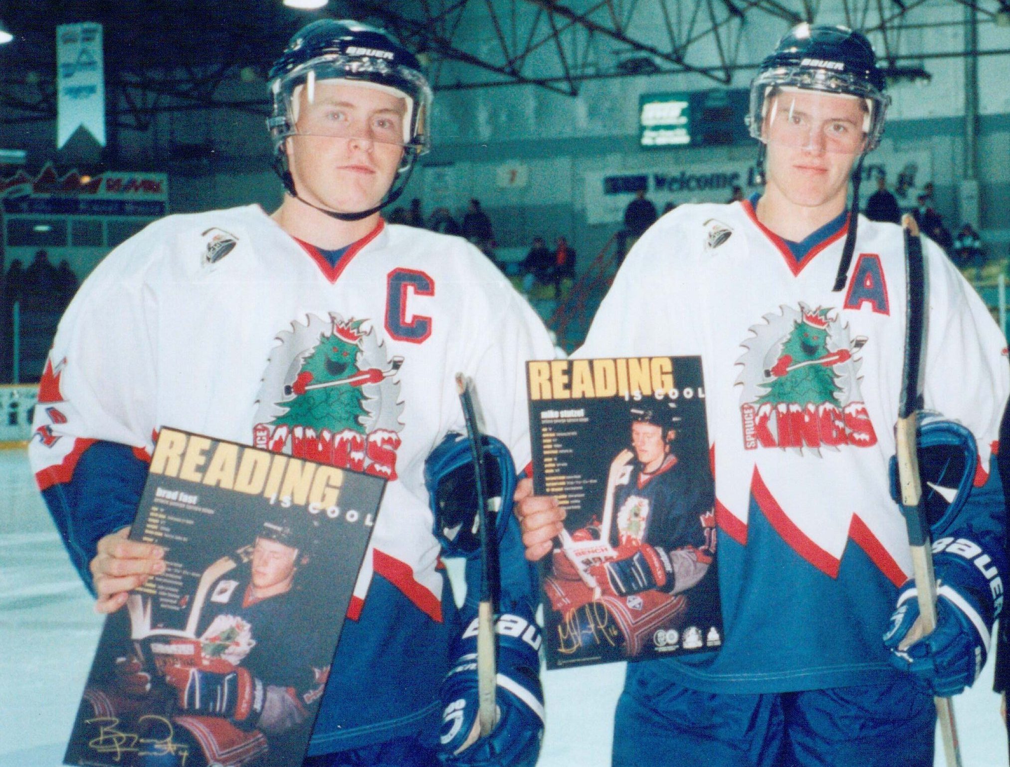
These jerseys are some of the most unique a BCHL team has created. The Spruce Kings had their classy crown logo during their Rocky Mountian Junior Hockey League and early BCJHL years.
But then PG came out with a fantastic cartoon spruce tree logo with a saw blade behind it to honor the logging industry up in northern BC.
The jersey was white with navy blue and red stripes that mimicked mountains on a diagonal pattern similar to the stripes on the old school Mighty Ducks jersey. The Spruce Kings also added cartoon crowns on the sleeves by the elbow.

3. Victoria Grizzlies 2006-07
The Salsa changed its name to the Grizzlies in 2006-07 and introduced the third-best jerseys in BCHL history – in my humble opinion.
These jerseys had the new Grizzlies logo with bear claw marks going down the arms and across the bottom of the jerseys. The bottom of the sleeves featured bear claws that made the claw marks.
On the white jersey, the claw marks were black and on the black jersey, the claw marks were yellow.
These jerseys were worn by current NHLers Jamie and Jordie Benn and only lasted the first season as the Grizzlies went to a more conventional look afterward.

2. Wenatchee Wild 2020-2021
Unfortunately, this jersey didn’t get a chance to grace the ice in the BCHL this season as the Wild took a hiatus because of border restrictions due to COVID-19. These jerseys are the best Wenatchee has come up with and better than its first jersey that was inspired by the Tampa Bay Lightning.
These added more gray to the colour scheme and follow previous designs by the NHL’s Hartford Whalers, BCHL’s Kelowna Spartans, and WHL’s Seattle Thunderbirds.

1. Chilliwack Chiefs 1998-2004
These are the greatest jerseys in the history of the BCHL. I might have some bias due to being from Chilliwack and had the opportunity to see the Chiefs wear these jerseys regularly.
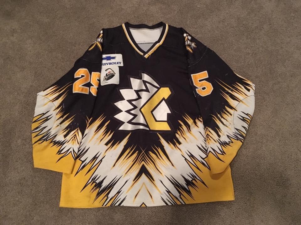
With their rebrand at the start of the 1998-99 season, the Chilliwack Chiefs thought outside the box. They switched from a classic red, white and blue color scheme to a more intimidating black, yellow, and white.
The jerseys moved away from traditional striping to diagonal spikes going down to the center of the bottom of the jersey then back up to just under the armpit.
The Chiefs also introduced a new shoulder patch of two tomahawks crossed with the “Chilliwack” wordmark across the shoulder. The Chiefs had their most successful runs in these jerseys, advancing to four BCHL finals, winning two Fred Page Cups, one Doyle Cup, and making two trips to the national junior A championship.


