The evolution of the Chilliwack Chiefs logo
(This article was originally published on Oct. 30, 2020.)
Kyle Rutherford, who is one of my fellow contributors at the BCHL Network, recently did an article about the Coquitlam Express logo changes over the years. The Express has gone through three colour changes, similar to the Chiefs, but has significantly changed its logo. Chilliwack hasn’t changed the logo too much over 30 years, but there have been some slight changes you might not have noticed.
I’ll look at the logos that the Chilliwack/Langley Chiefs have had over their 30 years of excellence.

The first logo the Chiefs came out with was their original colour scheme. The red ‘C’ has a double meaning given the City of Chilliwack itself and the Chiefs’ team name both start with the letter. The feathers and the face are blue.
The feathers are more up-shaped like a traditional Indigenous headdress. The spacing between the ‘C’ and the face and feathers are closer together than in later versions. The wordmark is a very generic simple block lettering. The team replicated the two fonts in the Chiefs’ return to Chilliwack in 2011.
This logo holds a special place in a lot of hardcore fan’s hearts and many want to see the team return to its original roots. The logo was used from 1990-98 and has been brought back on two occasions – for the 25th and 30th anniversaries.

In 1998-99, the Chilliwack Chiefs went through a colour change. This coincided with more young fans coming to games and getting away from a traditional hockey look. The Chiefs went black and yellow.
They also introduced the most iconic jersey in team history – the ProJoy Rage jersey. The logo was refurbished, making it more symmetrical and the lines sharper. The ‘C’ went from red to yellow and the feathers and face from blue to black. The bottom of the ‘C’ on the bottom is shaved down a bit and less pointed out to the front. The wordmark went from a more traditional classy kind of look to big and bold and blocky.

The Chiefs kept this logo design from 1998-2009, and it carried over for two seasons in Langley.

Around this time, they also introduced a secondary logo. It was two tomahawks crossed with Chilliwack in block letters curved across it. This logo also made the trip to Langley, with the wordmark changed from “Chilliwack” to “Langley”.
The move to Langley
When Chilliwack was awarded a Western Hockey League team in 2006, the Chiefs needed to find a new home. They moved to the recently vacated Township of Langley after the Hornets left for West Kelowna. The Chiefs didn’t actually change their logo from the one in Chilliwack for the first two seasons in Langley. The only change was the city name on the secondary logo.

The Chiefs eventually changed the logo to represent Langley. They dropped the “C” for an “L” in the headdress. The feathers were squared off to accommodate the “L”, and some war paint was added above it.
The Chiefs incorporated blue back into the jersey from the original colour scheme and brought an older version of their 2003-04 alternate jersey logo as a secondary shoulder patch. They kept this logo till the Chief’s name moved back to Chilliwack after the sale of the Quesnel Millionaires. The Chiefs still honour their time in Langley with the team photos from the five years on their wall of fame at the Chilliwack Coliseum.

The return to the ‘Wack
When the Chiefs arrived back in Chilliwack in 2011, they changed their colour scheme again. This time it was to match the crimson and gold seats at the Coliseum.
As the Chiefs were in a time crunch after the acquisition and relocation of the Quesnel Millionaires, the primary logo didn’t make its way to the jersey until 2012-13. Instead, they went with a more college feel featuring a ‘Chiefs’ wordmark and number underneath.
The logo they brought out had a big wordmark using two different fonts – similar to the original – with another updated chief’s head underneath that was very small. They went away from the big word mark and back to just the logo before the 2018 RBC Cup tournament.
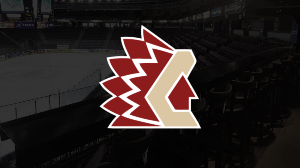
Not many noticed the change as it was the most incognito change a team could do. With the chief’s head back as the main focus, they again updated it with the new colours and proportioned it a bit more.
The top and bottom of the feathers have been brought to a point instead of squared off like the black and yellow logo. The team also introduced a white outline on the logo as it doesn’t invert the colours on the home and away jerseys like with the first two logos.
All indications are the Chiefs don’t plan on changing their colours anytime soon, but I think they should. The gold and crimson they introduced back in 2011 are hard to watch. The crimson completely dominates the dark jersey as everything is crimson, from the helmet and socks to the gloves and pants. With many in Chilliwack loving the retro looks from the past, the Chiefs could come up with a creative way to have some of the colours together.
They already have red from the original colours. I think they should incorporate black back into the logo and jersey from 1998, and get away from the gold. In 2018, the Chiefs third sponsor jersey had a version of the Chiefs logo on the shoulder but the “C” wasn’t gold. It was white and it looks amazing.
With such a big connection to the state of Michigan and having two players drafted by the Detroit Red Wings, it would be a shame to not try and honour that small connection somehow. It could be done in a classic and subtle way.