(This article was originally published on Jul. 24, 2020.)
For decades the Prince George Spruce Kings have based their primary jerseys on those worn by the New York Rangers. The Spruce Kings use the same jersey designs and team colours as the Rangers in almost every uniform they’ve ever worn. Every uniform except their alternate jerseys.
Other BCHL teams have based their primary and alternate jerseys on those worn by NHL teams. For example, the Salmon Arm Silverbacks primary jerseys resemble those worn by the Los Angeles Kings.
At separate points in their team’s history, the Vernon Vipers have based their jerseys on those worn by two different NHL teams. First with the Atlanta Thrashers and second with the Florida Panthers.
As for the Spruce Kings, they have designed unique alternate uniforms. Each of these alternates contains design elements carried over to the subsequent ones that followed. Each jersey also takes design elements from different NHL jerseys dating back over the last 80 years.
To understand what makes these jerseys unique, I will look at them individually, exploring what design elements they’ve borrowed from NHL teams and how they’ve incorporated them into these alternates. I also want to highlight the jersey trends they’ve followed when designing these alternates.
Fair warning, these articles contain my subjective opinion on certain things. Anyone who reads these is free to like or dislike any of these jerseys.
With this jersey, red is the main colour instead of blue. The crown logo is moved off the front of the jersey and to the shoulders. Replacing the crown in the centre is a Spruce Kings wordmark surrounding a jersey number in white lettering.
Jersey similarities
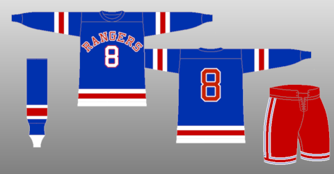
This Spruce Kings alternate has big similarities with two NHL jerseys. An Atlanta Thrashers alternate that was worn in the late 2000s and a New York Rangers jersey worn during the 1946-47 season.

For the Atlanta Thrashers alternate, Georgia Bronze became the primary colour instead of Thrasher Ice Blue. The centre contained a Peachtree Gold Thrashers wordmark above a jersey white jersey number.
During the 1946-47 season, the New York Rangers wore a jersey with the Rangers wordmark arching over a jersey number in the centre. It was the only time the Rangers ever wore a jersey like that as almost every primary Rangers jersey since then has displayed the team’s wordmark vertically.

Neither of these jerseys is used anymore. The Thrashers moved to Winnipeg to become the Jets in 2011 and the Rangers haven’t used this design in any of their various third jerseys and alternates over the years.
Despite that, the Thrashers and Rangers unique design choices live on in this Spruce Kings alternate. While the Spruce Kings have three team colours, they ultimately emulated the design choices used in the Thrashers final alternate jersey.
While the Spruce Kingshaven’t directly copied the Rangers other alternate jerseys, as you can see above they did copy one of the Blueshirts jerseys. They unintentionally borrowed a design choice from a Rangers jersey used in the 1940s. It’s a design choice that has in fact carried over to every alternate the Spruce Kings have worn since this jersey.
Overall, I like this alternate jersey and consider it to be one of my favourites.


