Spruce Kings alternates: the Avs-Stars connection
Most BCHL franchises use a wordmark in their primary logo. Teams like the Trail Smoke Eaters, Vernon Vipers, Victoria Grizzlies, and Wenatchee Wild all have jersey logos that incorporate some kind wordmark. The Prince George Spruce Kings are one of the exceptions.
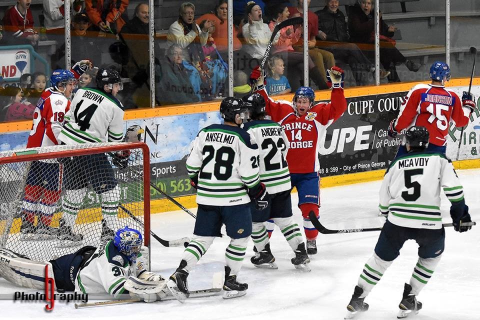
The main logo worn on their primary jerseys is a crown with no wordmark. However, their alternate jerseys all use wordmarks instead of the crown logo (with one exception). While this alternate jersey does use a wordmark, it is altered.
In my previous look at Spruce Kings alternates, I showed how similar their first alternate jersey was to jerseys worn by the Atlanta Thrashers and New York Rangers. This latest alternate jersey has more in common with jerseys worn by the Dallas Stars and Colorado Avalanche.
Both Dallas and Colorado’s jerseys were introduced in 2007, when Reebok was granted the exclusive contract to design and supply NHL jerseys. All 30 teams had their uniforms either completely redesigned or adapted to fit the new Rebook Edge System.
The teams that adapted chose to adopt a more traditional jersey style. They used designs that their teams have been wearing for decades. Teams like Montreal, Chicago, Detroit, and the New York Rangers made virtually no alterations to their jerseys.
While some teams adopted a traditional style others did not. They chose to embrace newer designs and take advantage of the new striping patterns available. Instead of a horizontal striping pattern around the waist, teams had vertical striping patterns that stretched from the waist to the collar.
The Reebok redesigns

From 2007 to 2017, the Avalanche wore this jersey. The trim along the bottom of the jersey was replaced with vertical striping. The sides of the jerseys underneath the player’s arms are blue. While other jerseys use similar striping patterns, this jersey was the closest in design to the Spruce Kings alternate.

This Dallas jersey moved the primary logo to the shoulders and replaced it with a wordmark. While this jersey came before the Atlanta Thrashers alternate mentioned before, I chose to use the Stars version here. This Dallas jersey was the only one in the league at the time to use a city name wordmark in place of a primary logo. The Vancouver Canucks also used the city name wordmark but it was in conjunction with their primary logo on the front of the jersey.
The Spruce Kings alternate incorporated the Avalanche’s and Stars’ design elements while carrying over elements from their previous jersey. The only things that changed were the striping pattern, the shoulders, and the wordmark reading Prince George instead of Spruce Kings.
Of all the Spruce Kings alternates, this one stands out the most as the others didn’t use this striping pattern. This alternate chose to use design elements from NHL jerseys that were eventually replaced.

In 2013, Dallas completely redesigned its uniforms after Tom Gaglardi bought the team. After the NHL’s jersey contract went to Adidas, the Avalanche went back to their traditional striping pattern. The only teams that continue to use the vertical striping pattern in their jerseys are Anaheim, Calgary, and Washington.
Every other team has chosen to change to a more traditional style of uniform. Even the Spruce Kings chose to revert to a more traditional striping pattern with their next alternate jersey.
Final thoughts
All things considered, this Spruce Kings alternate isn’t one that I like. There’s too much white in the jersey. Replacing the white with blue might make it more aesthetically pleasing to look at.
Also, I’m glad that this was a one-off and that the Spruce Kings’ other alternates have used this striping pattern. Although, the next alternate jersey is itself unique. Keep an eye out for my next article highlighting it.